Atomix
B2B SAAS · UX/UI · 2025מערכת B2B להעברת הודעות שמתרחבת ל-B2C. עיצוב אתר מותג מודרני שמציג את המוצר ומגדיל המרות. עיצובי תוכן ב-3 צבעים — ירוק/לבן/שחור.
30 שניות, אם אתה ממהר.
פרויקט בקנה מידה גדול — הצגת מגוון מוצרים ויכולות בצורה ויזואלית קלה להבנה ומכוונת המרות. שמירה על אלמנטים מהאתר הקיים (בלוג, מאמרים), זיהוי חולשות אצל המתחרים, והצעת שיפורים שמדגישים את המוצר.
תהליך אפיון מקיף עם הלקוח, מחקר שוק וניתוח תחרותי. אדריכלות אתר ו-user flow לפי הקהל. דגש על מידע מוצר ברור ונגיש.
אתר מלא: עמוד הבית, Pricing עם calculator B2B, מאמרים, דפי מוצר נפרדים, ו-Features page. גם בעברית וגם באנגלית.
אתר B2B SaaS שמציג מגוון מוצרים בצורה נגישה.
תהליך UX
For the UX design, I began by conducting a thorough characterization session with the client, utilizing a detailed questionnaire to understand their needs and target audience. Following this, I conducted market research, including competitive analysis and general benchmarking.
This allowed us to identify key areas for improvement and define our unique selling proposition. Based on these insights, I developed the site's architecture and user flow, aligning with both the client's and the target audience's requirements.
The site's primary objective was to ensure clear and accessible product information for potential customers. Three product pages with sticky menus and prototype videos.
The Pricing page innovation: a personalized calculator for premium plans where users enter parameters and receive an exact price. Solves the problem of "too many options confuse the buyer".
ירוק/לבן/שחור — צבעי הלוגו
For the site's UI, I chose a color palette of green, white, and black, directly reflecting the company's logo. These colors also resonate with the target military audience.
To further connect with this demographic, the design incorporates imagery of deer, a symbol highly recognizable within that community and fitting the overall theme.
The use of green also served to create a sense of calm, a key aspect of the desired user experience.
גם הצעתי גרסה Dark Mode שאושרה ואהובה — אך לא יושמה בסוף עקב מגבלות זמן של החברה.
המוצר עצמו.
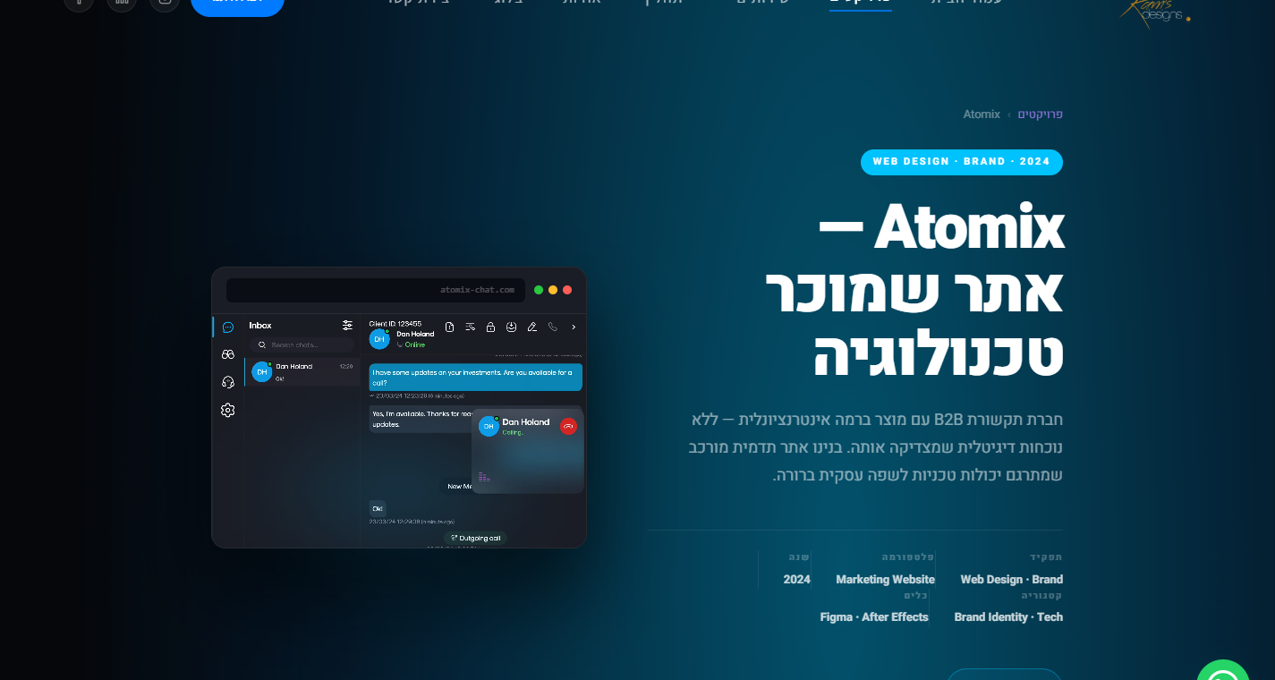
Smart Communication Platform
Hero עם mock ממשק Chat ו-CTA כפול: "Contact us" + "Start free trial". ממשק צ'אט מוצג בתוך mock-app שמראה multi-party conversation בזמן אמת.
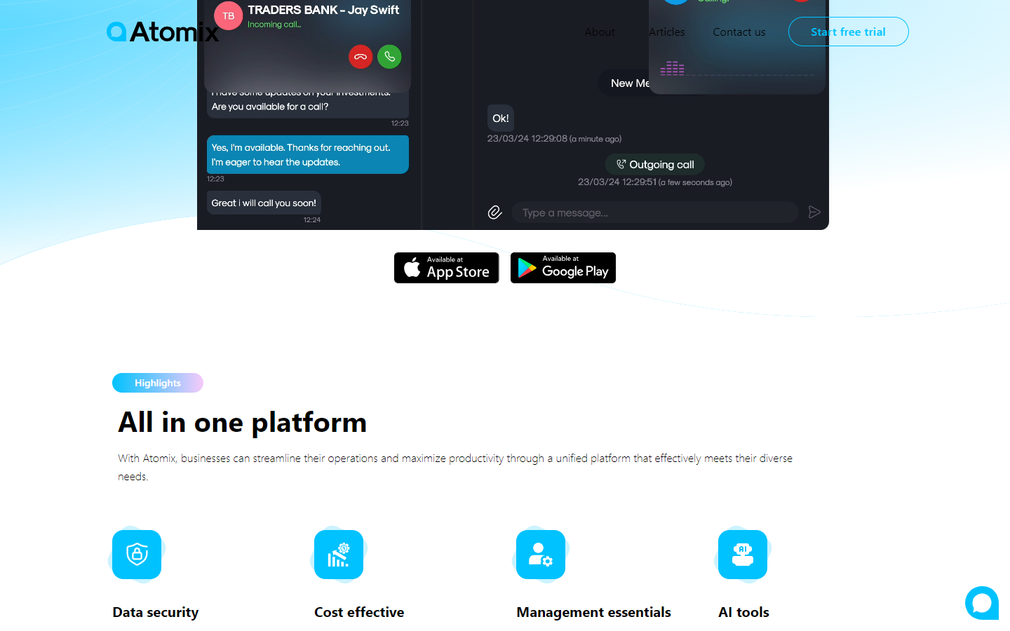
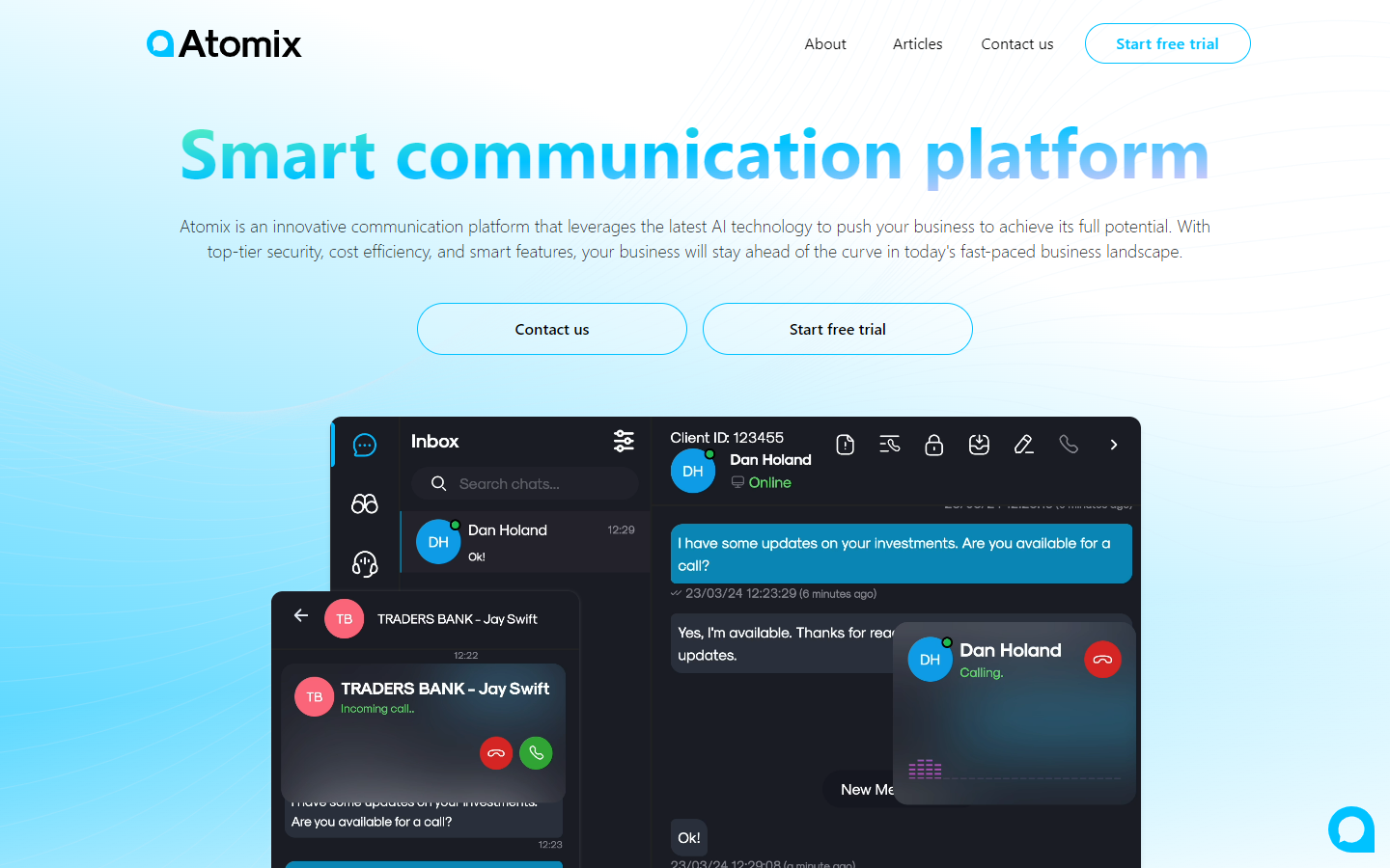
All in One Platform — App Store
הורדת האפליקציה ל-iOS ו-Android. מתחת: 4 כרטיסי features — Data Security, Cost Effective, Management Essentials, AI Tools. כל feature עם אייקון ו-3 שורות הסבר.
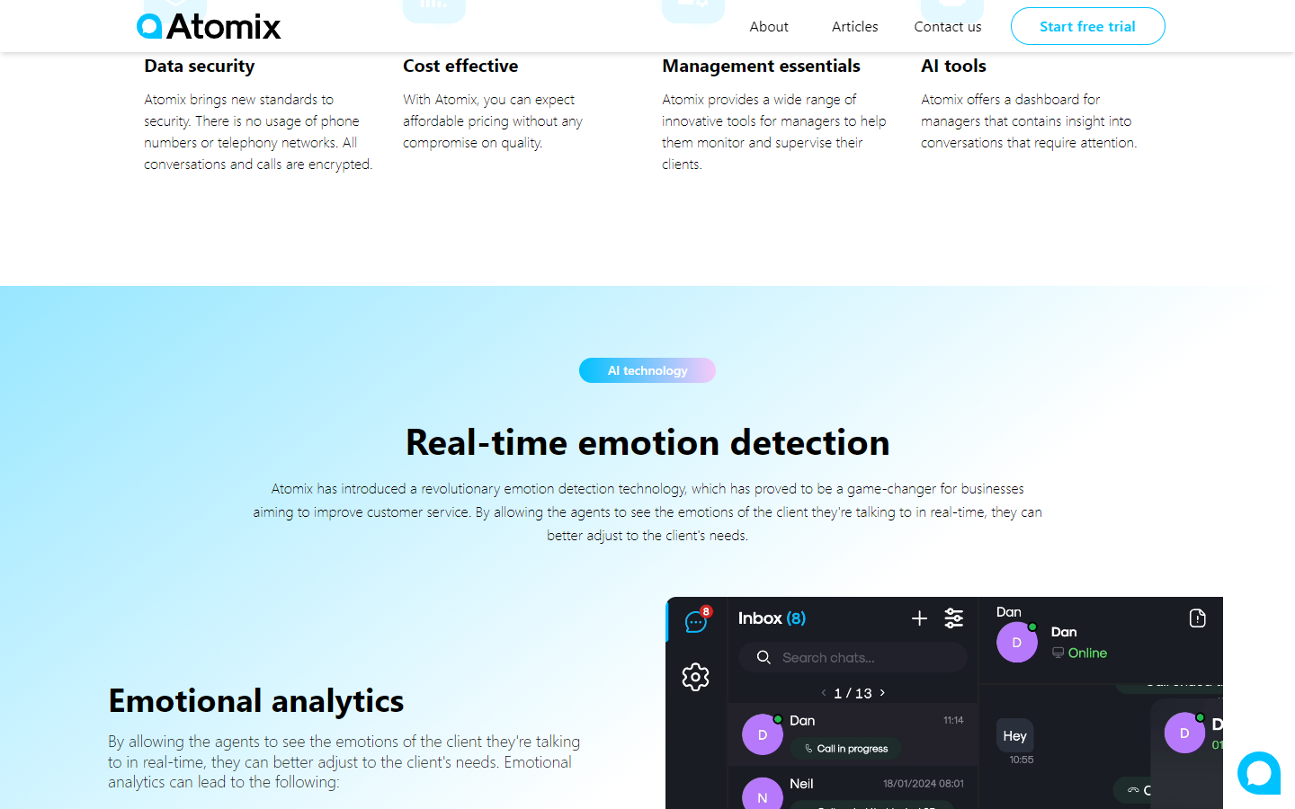
Real-Time Emotion Detection
החדשנות המרכזית — Emotional Analytics שמאפשרת לנציגים לראות את הרגש של הלקוח בזמן שיחה. dashboard מוצג עם ממשק inbox וניתוח רגשות.
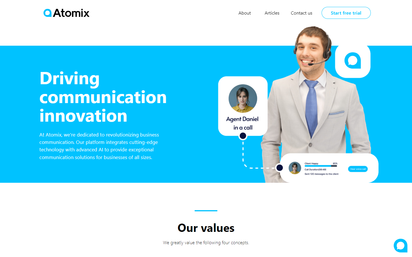
Driving Communication Innovation
עמוד About עם hero ויזואלי — נציג עם headset, mock UI של "Agent Daniel in a call" עם Client Happy 85% ו-Call Duration. חוצה טכנולוגיה ואנושיות.
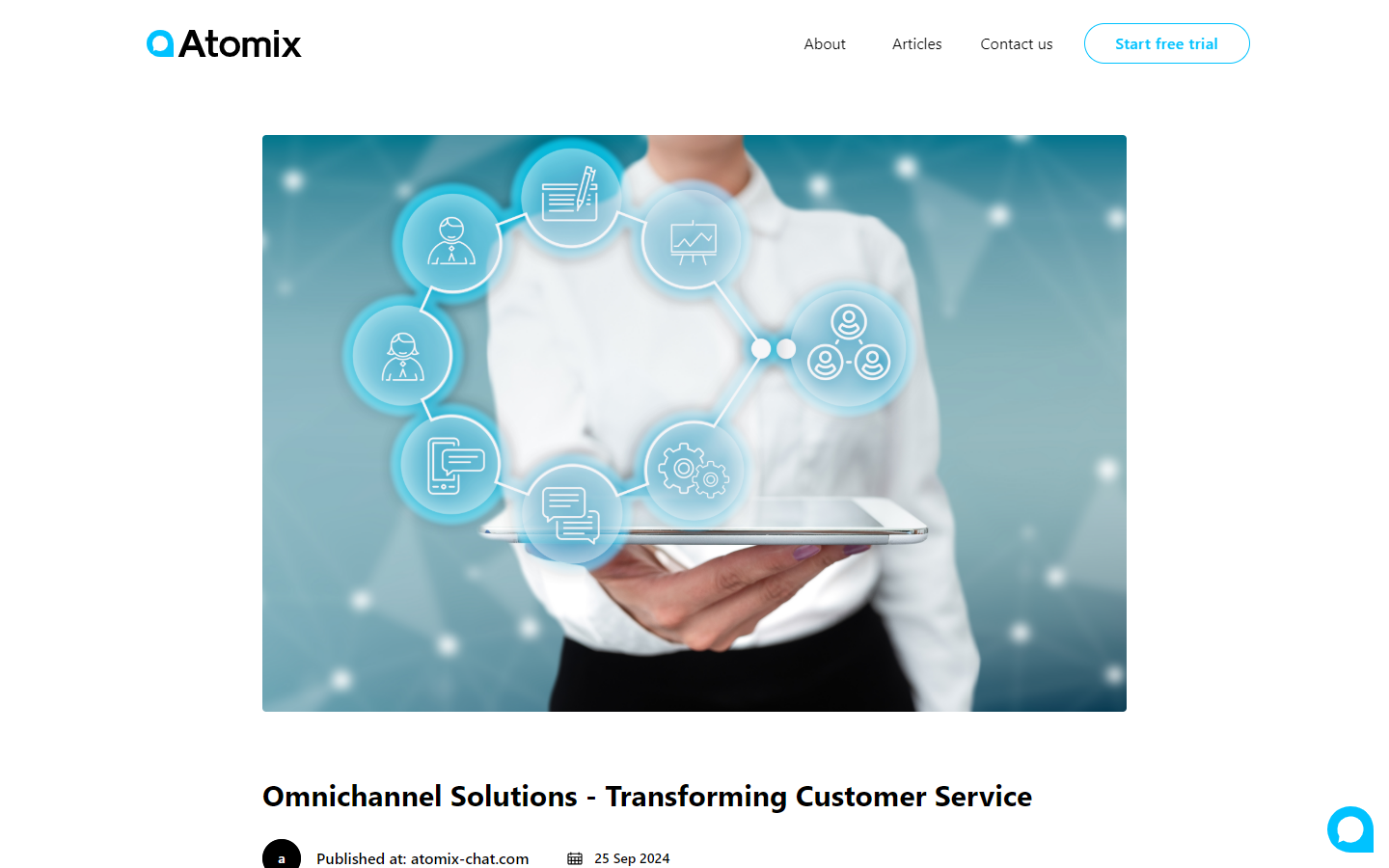
Omnichannel Solutions Blog
מאמרי תוכן מקצועי — "Transforming Customer Service". בלוג עם תמונת hero, תאריך פרסום וכתובת. מיצוב Atomix כמחשבת מוביל בתחום.
איך ניגשנו לפרויקט.
העקרונות שהובילו אותי
Pricing Calculator
מחשבון מותאם אישית למשתמשי premium — פותר את הבעיה של "יותר מדי אופציות".
Sticky Menus
מאמר ארוך ודפי מוצר עם תפריט צד שמתגלגל — נגישות מתמדת.
Prototype Videos
במקום הסבר טקסטואלי על פיצ׳ר — וידאו של 8-15 שניות שמראה אותו.
Dual Language
עברית ואנגלית במקביל — חברה ישראלית עם שאיפות גלובליות.
תהליך עבודה
תהליך מקיף שכלל מחקר משתמשים, הגדרת אסטרטגיה, יצירת מערכת עיצוב מקיפה, פיתוח ויישום סופי.