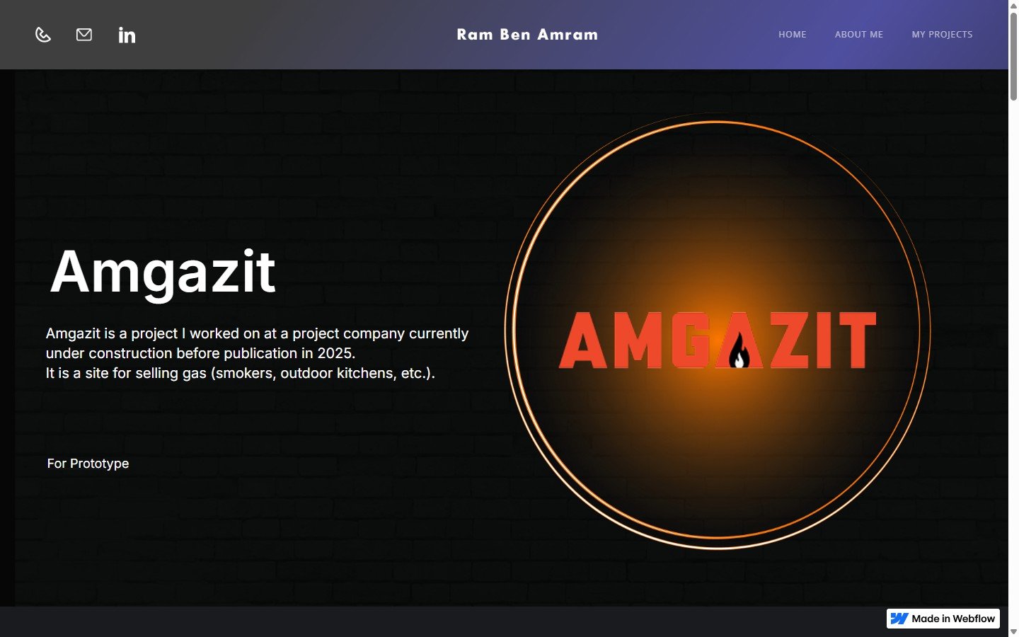
אמגזית
E-COMMERCE · GAS · 2025אתר מכירות לציוד גז (מעשנות, מטבחים חיצוניים). עיצוב מחודש לקהל צעיר יותר, עם דגש על אינטראקטיביות ואסתטיקה של אש.
30 שניות, אם אתה ממהר.
I was asked to take their old website and give it a new look with an emphasis on up-to-date UX for their new purposes. Previously targeted older audience, now wants younger (28-40).
שינוי קהל יעד מ-50+ ל-28-40 → שינוי כל ה-UX. טאבים בעמוד מוצר הופכים לכפתורי אייקונים. הוספת וידאו hero. צבעוניות אדומה עזה.
אתר עם וידאו hero, 2 שורות קוביות קטגוריות, באנרים מותאמים אישית, וטאבים אינטראקטיביים בעמוד מוצר.
מאתר ל-50+ אל אתר לדור Y.
מאמן קהל לכל ה-UX
The meeting started with a meeting with the client, who has an old website he wants to renew. He mentioned that there are several important things, one of which is his target audience.
Previously, he targeted an older audience and now he wants a younger audience, so the entire UX concept here has changed. I adjusted the new website to be more tailored to a target audience of 28-40 years old.
Adjustments were made to make the site more interactive — tabs on the product page, where I decided on an approach more suitable for a younger audience and we went from titles to buttons with icons, knowing that the younger audience understands the meaning and language.
In order to evaluate the market, I searched for competitors and conducted a market analysis — מותגי גז גלובליים שמיעדים לקהל צעיר עם אסתטיקה חיים-בריא ופרימיום.
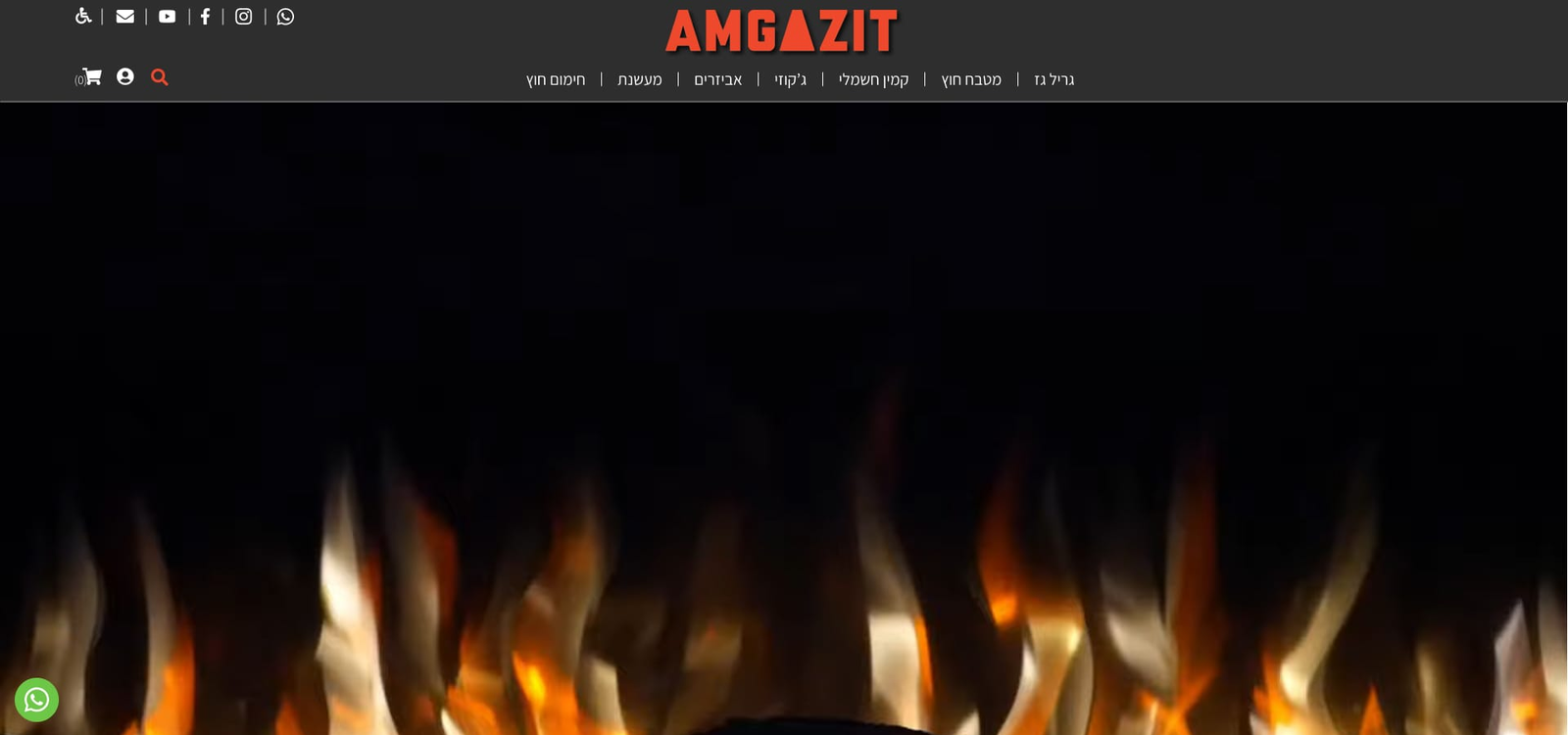
אדום של אש
UI-wise, the color red was chosen since it represents fire and gas in a vivid manner.
Additionally, since this is a young audience, we wanted to give the site a younger appearance, so we rounded the frames, added a banner as the title, and inserted more video clips and added effects.
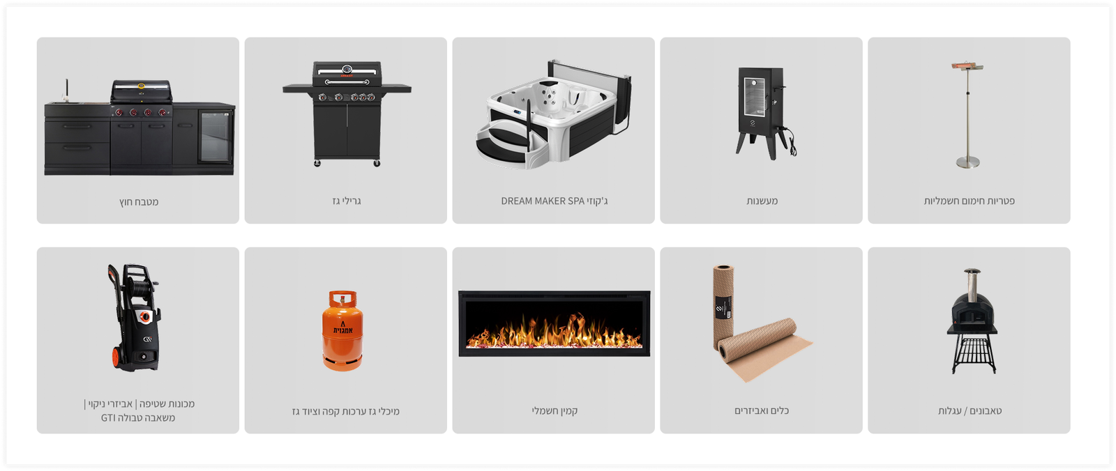
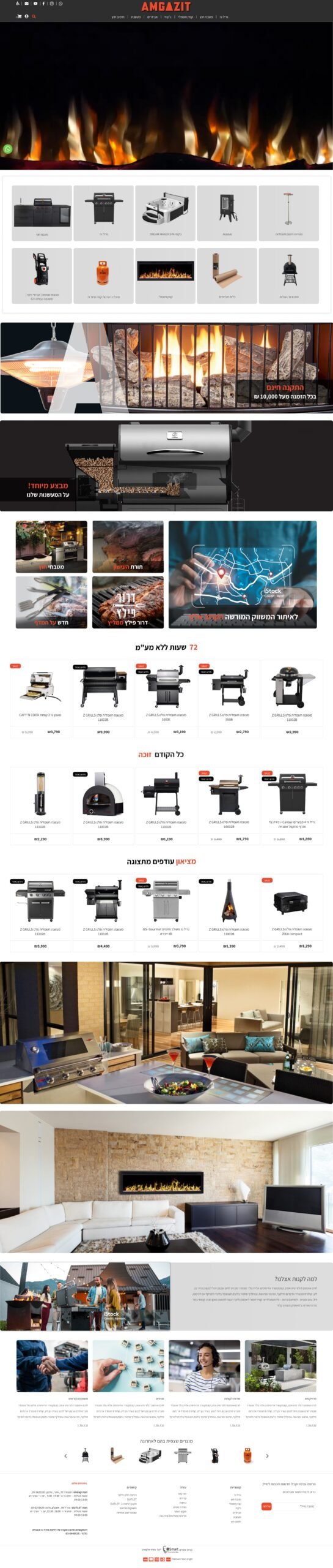
הירו עם וידאו של מוצר פופולרי — אווירה תחושתית במקום static image. כשמרחפים על התפריט, תפריט קטן נפתח. 2 שורות קוביות באפור עם תמונות קטגוריות.
מתחת — 4 קוביות מבצעים, 2 תמונות אווירה, באנר "Why Buy From Us", ו-4 קוביות לבלוג. עומס שמטרתו ל-engage ולא לבלבל.
המוצר עצמו.
Amgazit — Brand הלהבה
לוגו עם טיפת אש בתוך ה-G — אמביגרמה שמסמלת גז ואש. צבע כתום-אדום על שחור. זהות מותגית שמדברת ישירות לקהל הצעיר שמחפש ציוד חיצוני.
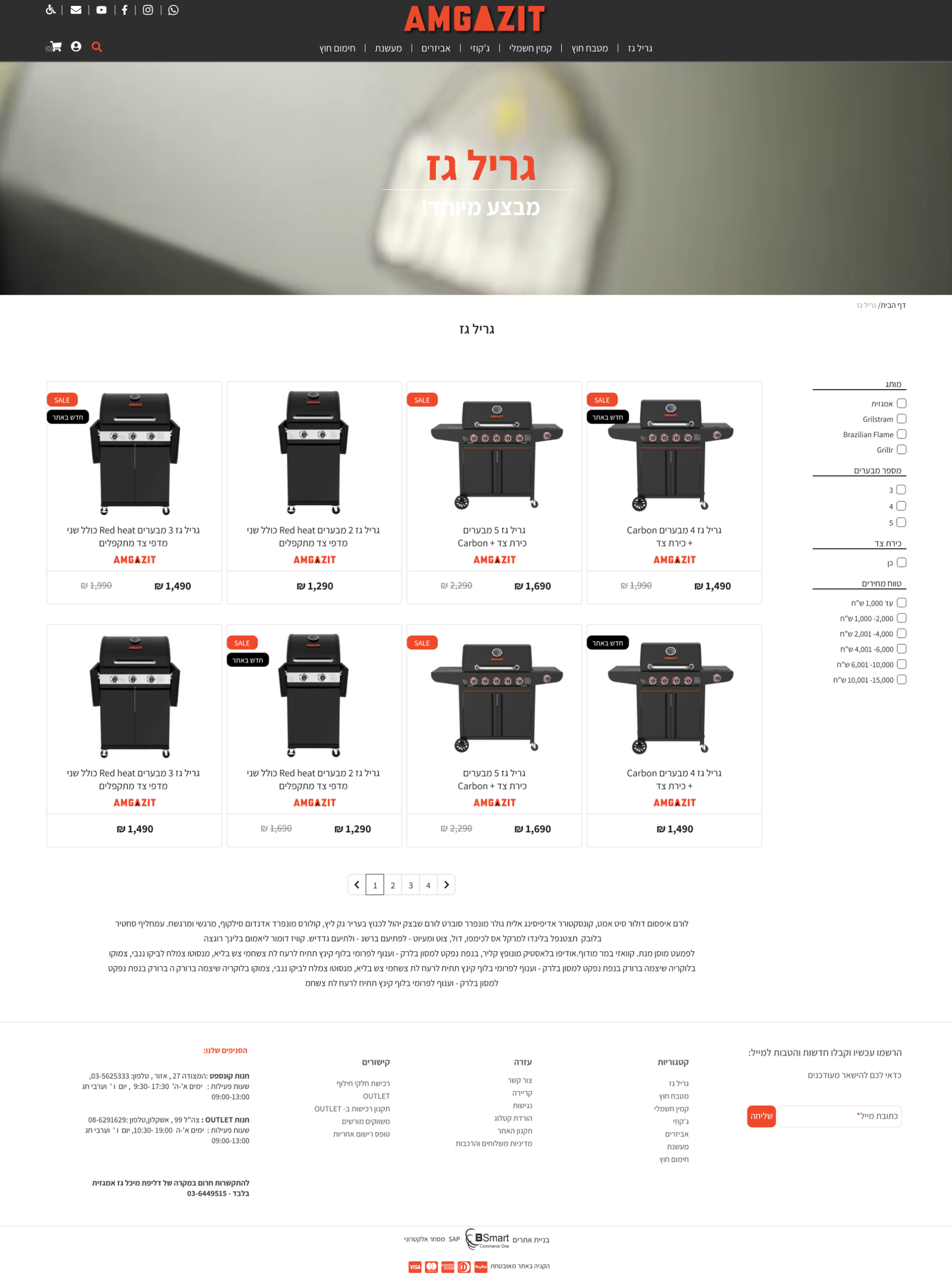
רשימת מוצרים — Grid + Filters
דף קטלוג מוצרים: Grid layout עם תמונות מוצר גדולות, תגי קטגוריה, מחיר בולט, ו-CTA "הוסף לסל". סינון לפי קטגוריה (מעשנות / גרילים / מטבחים חיצוניים). עיצוב מודרני לקהל 28-40.
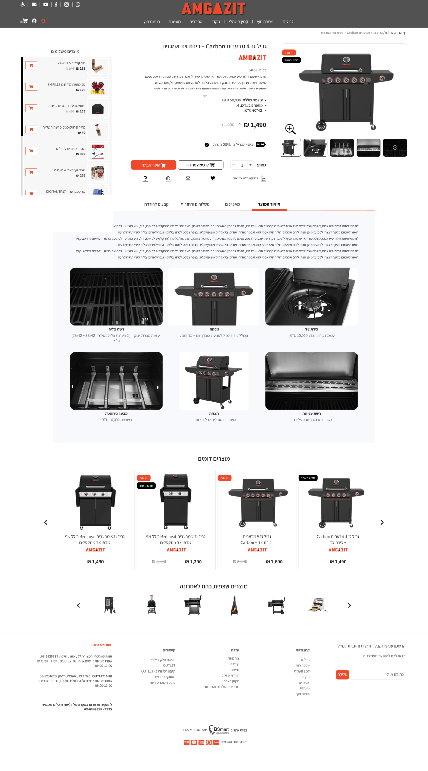
PDP — גריל Carbon עם טאבים אינטראקטיביים
עמוד מוצר: גלריית תמונות, מחיר בולט 1,499₪, CTA אדום "הוסף לסל". טאבים אינטראקטיביים בגלילה: כפתורי אייקונים במקום טקסט (תיאור / מפרט / ביקורות). חידוש UX מתאים לדור Y.
Homepage — Video Hero + קוביות קטגוריות
Homepage: Hero video של מוצר פופולרי, 2 שורות קוביות קטגוריות עם תמונות, 4 קוביות מבצעים, ו-banner "Why Buy From Us". תפריט hover עם sub-menu. אסתטיקת אש-עיצוב לקהל צעיר.
Wireframes — UX Architecture
wireframes מהתהליך: Homepage layout עם כל הסקשנים, product list structure, ו-PDP flow. מחקר תחרותי של מותגי גז גלובליים שמיעדים לקהל צעיר. שינוי קהל יעד מ-50+ ל-28-40 → שינוי כל ה-UX.