Atomix
This project was completed in 2025, where I served as the sole designer for the company. The company primarily offers a B2B messaging system and is currently expanding into the B2C market.The goal was to design a modern, high-quality, and distinctive branding website that effectively showcases the product and its value.
The Challenge
This is a large-scale project that presented several challenges.First, how to effectively showcase the wide range of products and features the system offers in a way that is both visually appealing and easy to understand — while driving conversions.Another challenge was preserving key elements from the original site, such as the blog and articles sections.Additionally, it was crucial to identify weaknesses on the current site and among competitors, and to propose improvements that would better highlight and sell the product.
Offers
The site serves to showcase their existing products and expand their customer base by reaching potential clients
About The Process- UX
For the UX design, I began by conducting a thorough characterization session with the client, utilizing a detailed questionnaire to understand their needs and target audience. Following this, I conducted market research, including competitive analysis and general benchmarking. This allowed us to identify key areas for improvement and define our unique selling proposition. Based on these insights, I developed the site's architecture and user flow, aligning with both the client's and the target audience's requirements, as initially established. The site's primary objective was to ensure clear and accessible product information for potential customers.
About The Process- UI
For the site's UI, I chose a color palette of green, white, and black, directly reflecting the company's logo.
These colors also resonate with the target military audience.
To further connect with this demographic, the design incorporates imagery of deer, a symbol highly recognizable within that community and fitting the overall theme.
The use of green also served to create a sense of calm, a key aspect of the desired user experience.
Wireframes
I will now introduce the screens and their components.
The home page first consists of the hero section, where there is a small image of the system next to the company name with a short sentence about the product and a call to action button.Below is a video of a prototype of the cave highlights with all the most important things to give the user a general background of what it looks like and what is there and to help encourage the sale of the product. Next to this is some information about the company and what it does.Below this are 3 sections of the main products that the system offers with a video prototype of each of them, a short explanation and a button to go to the product page where they can get a more in-depth explanation.Below this is the explanation section of why choose this product?Below is a call to action button and the latest articles and below the footer.
The home page

The home page- mobile version

The home page- mobile version
The side menu when opened shows all the options.

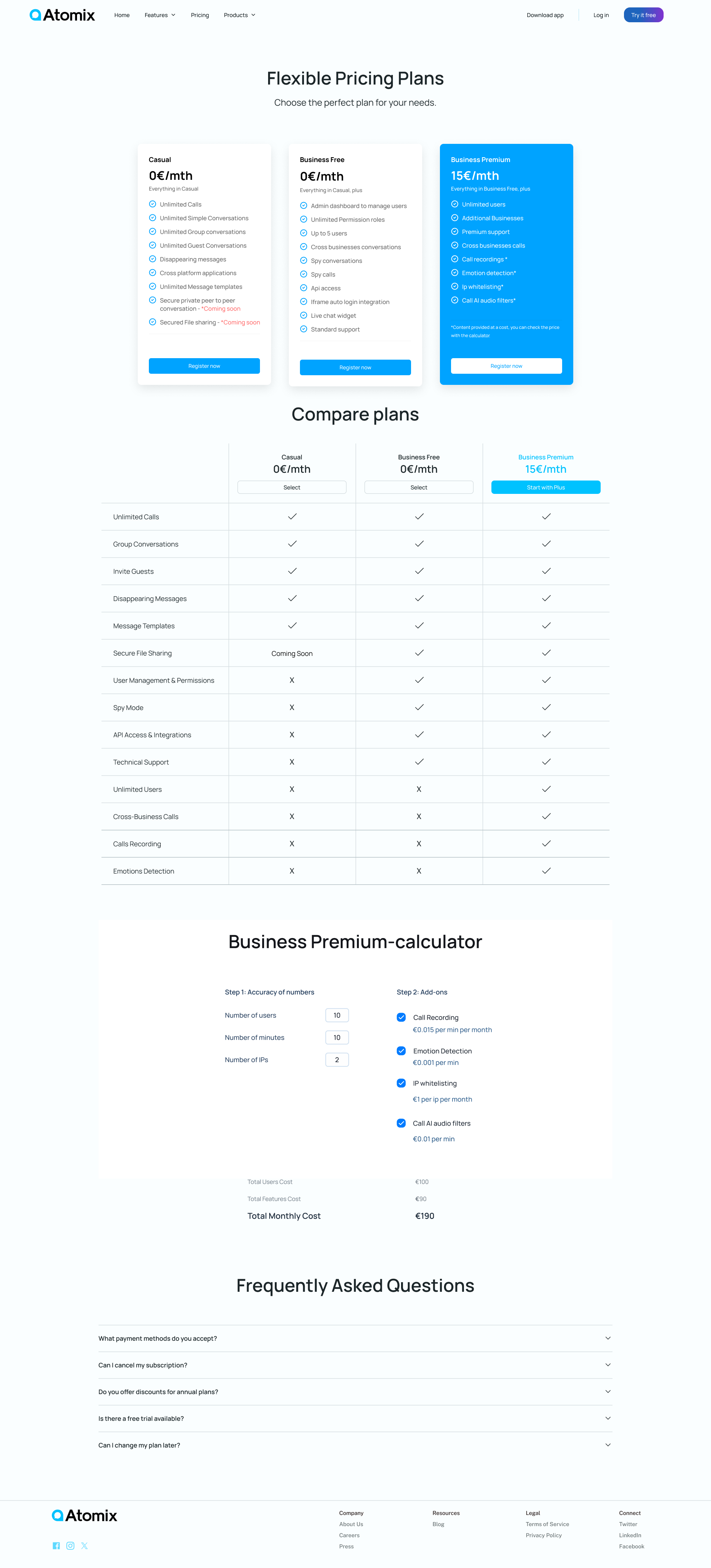
Pricing page
The page is built first of all from a breakdown and presentation of the 3 packages that the company offers for a user of the product and with package selection options. "Flexible Pricing Plans"Underneath this "Compare plans" in order to emphasize the differences between the packages, I created a table of comparison between the packages that also includes a selection button and mainly a breakdown of all the options of each category next to each other so that for each small feature the customer can compare and decide what is best for him.Underneath this is the "Business Premium-calculator" which was actually a thought that the potential customer could be confused by all the options and add-ons that each have a different cost and not understand what the price of what he needs is, so I thought of creating a personalized calculator for the customer who wants premium plans. He enters the data and answers the parameters there and receives the exact price he is supposed to pay.Underneath this is an FAQ with common questions and answers about the plans.

Pricing page- mobile version
The big problem here was the mobile screen - here it was necessary to adapt the table section to all resolutions, so several options were created, the two most prominent of which were:1. Displaying the title at the top in a bold line and below the line with the comparisons.2. Option to select 2 programs and then compare them.

Articales page

Articales page- mobile version

Artical page- The right area is a sticky menu area that scrolls with the mouse, so you can always choose your favorite section.

Artical page- mobile version

First product page.
It is initially composed of a large video prototype window. Below it are the pizzas that make up it and next to it is the sticky menu for each of the pizzas.

First product page - mobile version

Second product page

Second product page - mobile version

Third product page

Third product page - mobile version

Feature Page - This is a page with details about each fitzer in the system.Here the design decision is slightly different and there is no background or pattern because there could be very little information and not like in the example here where there are 3, there could also be only 1 section or even just one sentence, so it was decided not to put a background.

Feature Page - Mobile Version

Downloads page - a page that centralizes all of the system's download options and includes a button option that highlights the selection.

Downloads page - mobile version

As part of my suggestions, I also proposed a dark version of the design, which was accepted and very well-liked, but in the end it did not materialize due to internal constraints of the company (such as time, for example).
Home page:

Pricing page

Articales page

Artical page

Mobile version of the homepage

The menu here is a hamburger menu.

Product list+ Filter

Product page

Product page - Product Review

Product page - Product Review when there are no pictures and only content

The characteristics - entered here as part of the categories

Product page - Size chart.
This is balanced following a request from the programmers.


