

Atomix
B2B SAAS · UX/UI · 2025מערכת B2B להעברת הודעות שמתרחבת ל-B2C. עיצוב אתר מותג מודרני שמציג את המוצר ומגדיל המרות. עיצובי תוכן ב-3 צבעים — ירוק/לבן/שחור.
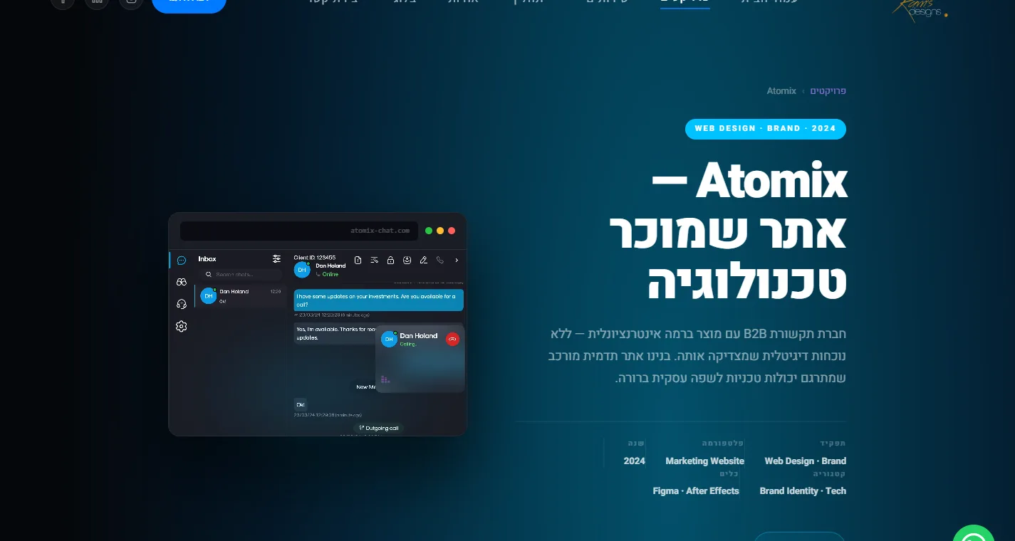
30 שניות, אם אתה ממהר.
פרויקט בקנה מידה גדול — הצגת מגוון מוצרים ויכולות בצורה ויזואלית קלה להבנה ומכוונת המרות. שמירה על אלמנטים מהאתר הקיים (בלוג, מאמרים), זיהוי חולשות אצל המתחרים, והצעת שיפורים שמדגישים את המוצר.
תהליך אפיון מקיף עם הלקוח, מחקר שוק וניתוח תחרותי. אדריכלות אתר ו-user flow לפי הקהל. דגש על מידע מוצר ברור ונגיש.
אתר מלא: עמוד הבית, Pricing עם calculator B2B, מאמרים, דפי מוצר נפרדים, ו-Features page. גם בעברית וגם באנגלית.
אתר B2B SaaS שמציג מגוון מוצרים בצורה נגישה.
תהליך UX
For the UX design, I began by conducting a thorough characterization session with the client, utilizing a detailed questionnaire to understand their needs and target audience. Following this, I conducted market research, including competitive analysis and general benchmarking.
This allowed us to identify key areas for improvement and define our unique selling proposition. Based on these insights, I developed the site's architecture and user flow, aligning with both the client's and the target audience's requirements.
The site's primary objective was to ensure clear and accessible product information for potential customers. Three product pages with sticky menus and prototype videos.
The Pricing page innovation: a personalized calculator for premium plans where users enter parameters and receive an exact price. Solves the problem of "too many options confuse the buyer".
ירוק/לבן/שחור — צבעי הלוגו
For the site's UI, I chose a color palette of green, white, and black, directly reflecting the company's logo. These colors also resonate with the target military audience.
To further connect with this demographic, the design incorporates imagery of deer, a symbol highly recognizable within that community and fitting the overall theme.
The use of green also served to create a sense of calm, a key aspect of the desired user experience.
גם הצעתי גרסה Dark Mode שאושרה ואהובה — אך לא יושמה בסוף עקב מגבלות זמן של החברה.
שני פרויקטים. כל מסך.
מאפליקציית הצ'אט ועד האתר — כל עמוד עוצב בנפרד עם כוונה ברורה.
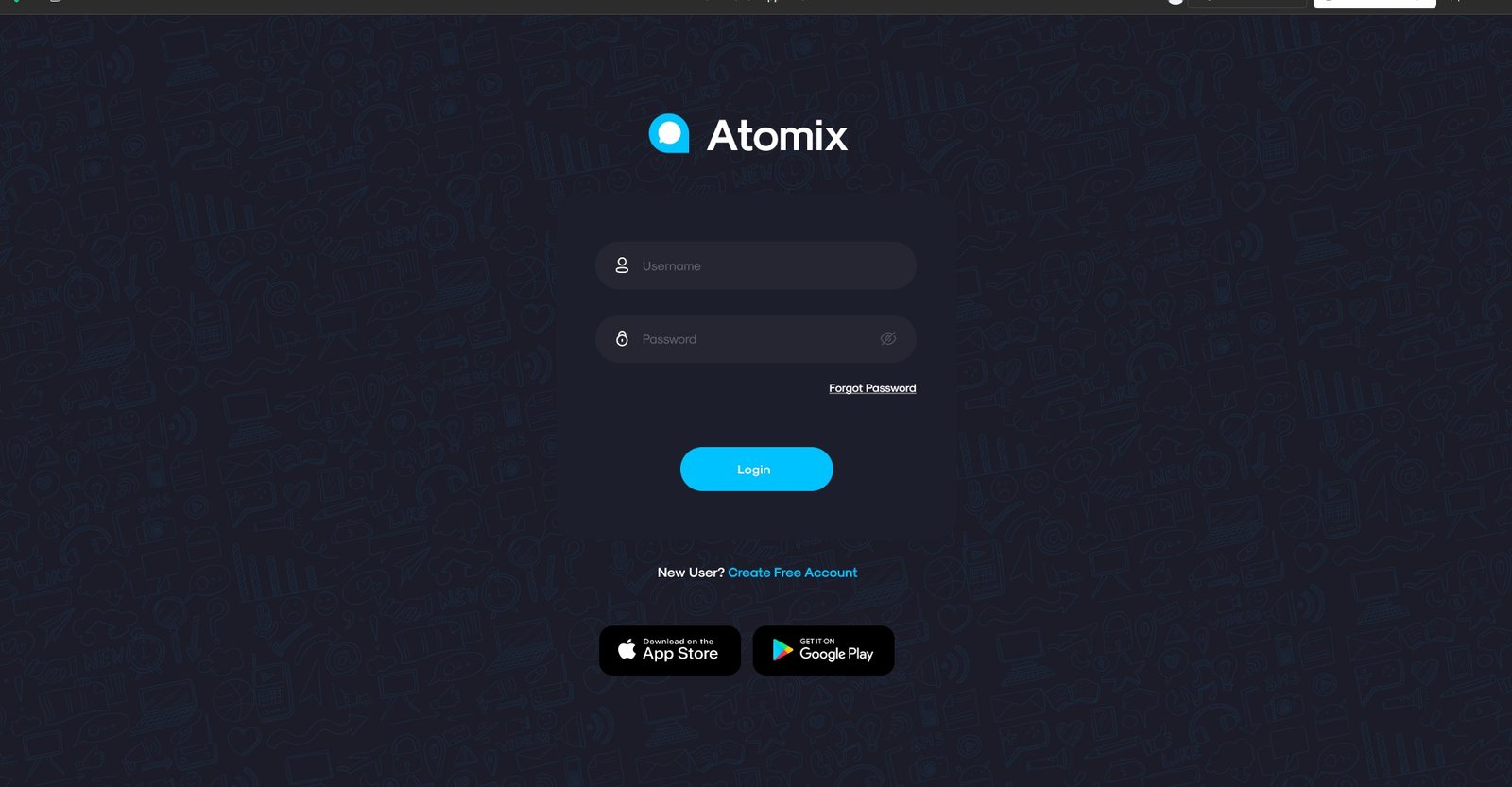
כניסה למערכת
מסך כניסה עם Logo + Username/Password + Forgot Password. Dark minimal עם background texture עדין ועקביות מלאה עם מערכת העיצוב. App Store + Google Play links למשתמשים mobile.
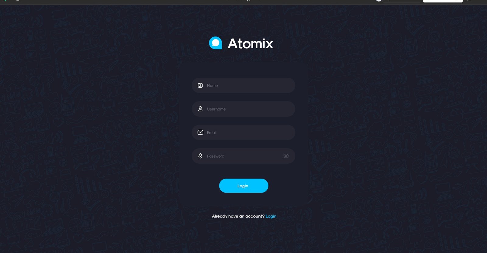
הרשמה חדשה
הרשמת ארגון — Name, Username, Email, Password. Form fields מוקפדים עם validation states ועיצוב עקבי לחלוטין עם מסך הלוגין. Consistent dark theme לאורך כל ה-onboarding flow.
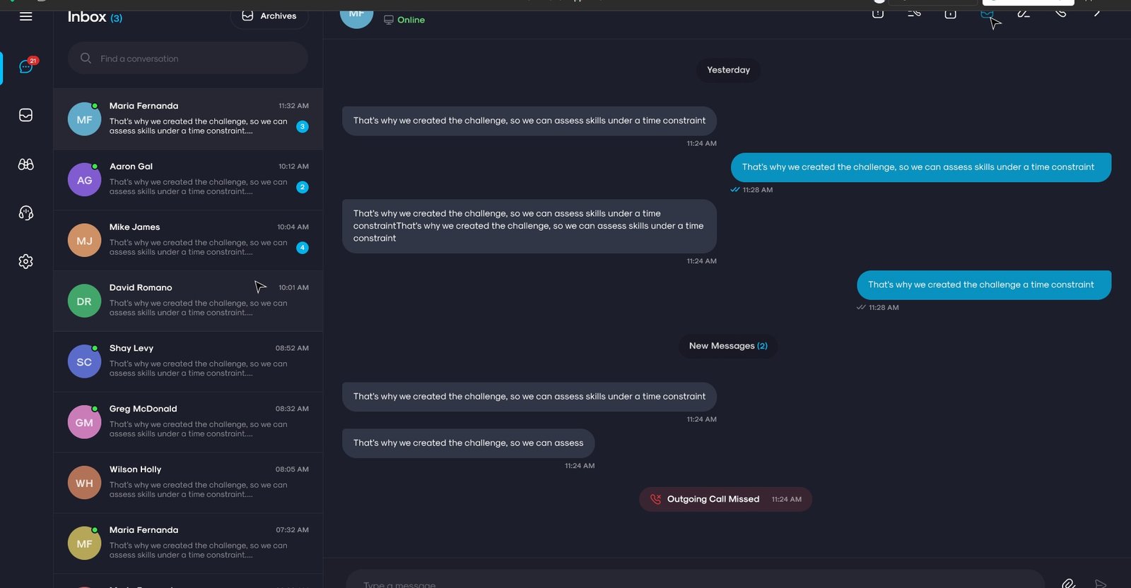
ניהול שיחות — Inbox מנהל
לב המערכת: רשימת שיחות פעילות בעמודה שמאל (Maria Fernanda, Aaron Gal, Mike James ועוד), Conversation Panel עם message bubbles מלא, וסרגל navigation עליון עם כל הכלים. המנהל שולט על כל שיחה מנקודה אחת.
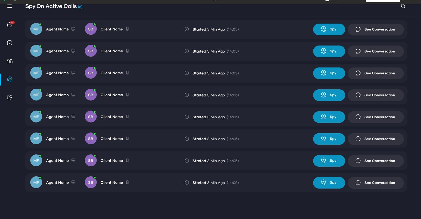
Spy On Active Calls
פיצ׳ר ייחודי: המנהל רואה את כל השיחות הפעילות בזמן אמת — Agent Name, Client Name, זמן התחלה, וכפתורי Spy (האזנה) ו-See Conversation (צפייה בשיחה). שליטה מלאה ב-quality monitoring ללא הפרעה.
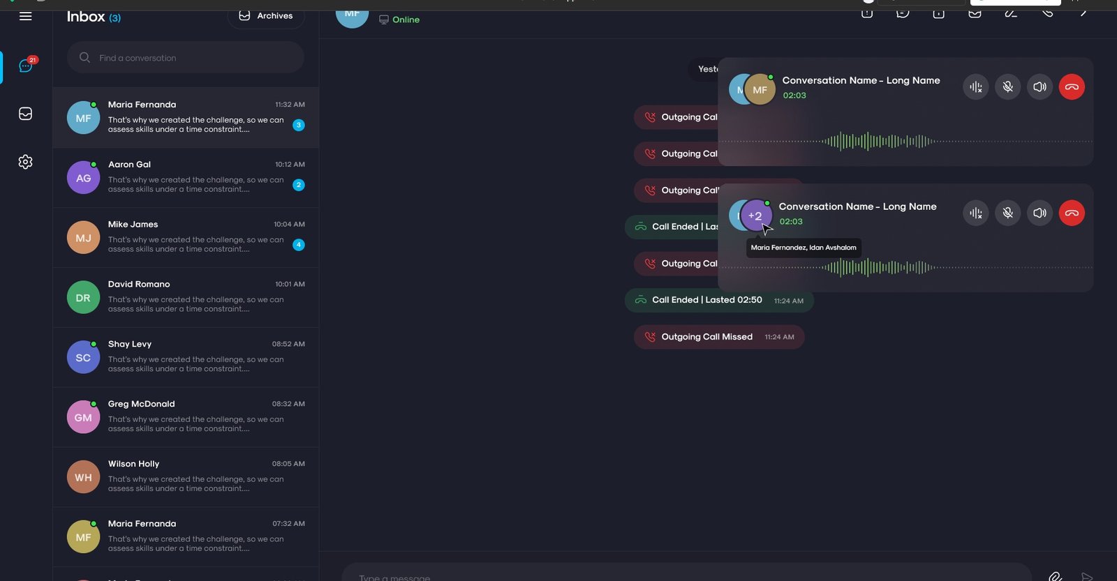
Inbox נציג — שיחה פעילה
הנציג מקבל שיחה נכנסת תוך כדי ניהול ה-inbox: קופץ call modal עם שם הלקוח, סטטוס "Connecting to Call Server", כפתורי Mute/Speaker/Hang Up. Inbox מלא ברקע עם כל השיחות הפעילות.
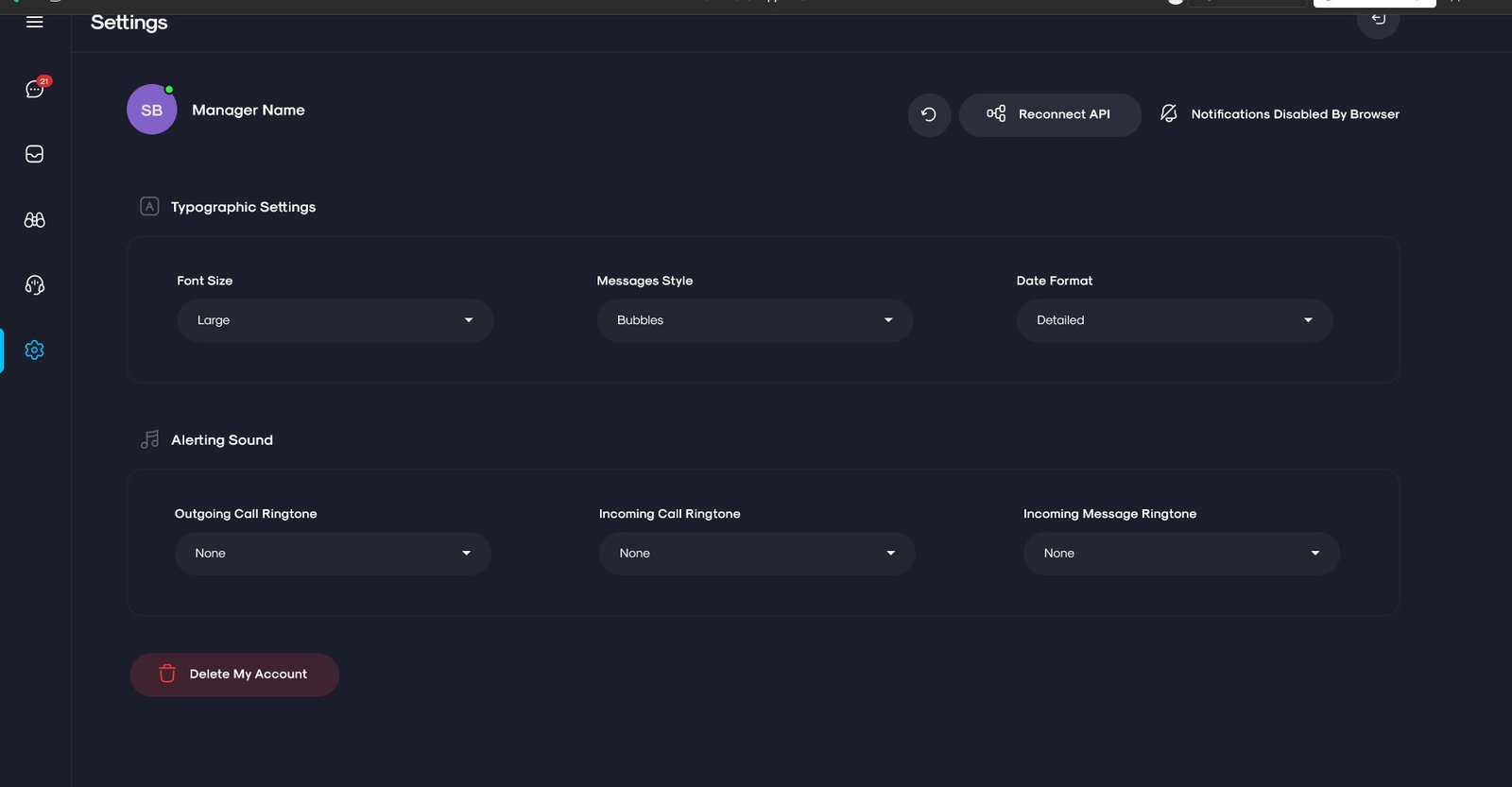
הגדרות מערכת
Typographic Settings (Font Size, Messages Style, Date Format) ו-Alerting Sound (Outgoing/Incoming Ringtones). Navigation sidebar עם 5 categories. פשוט, מסודר, ניתן לסריקה בבת-עין.
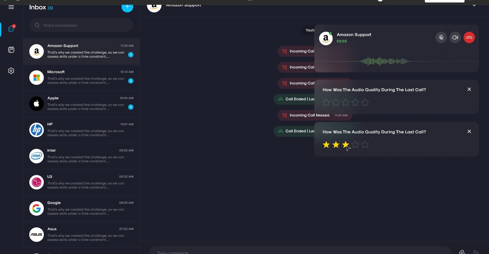
Inbox לקוח — חברות B2B
ממשק הלקוח — Amazon Support, Microsoft, Apple, HP, Intel, Google ועוד. לאחר שיחה: popup דירוג "How Was The Audio Quality?" עם 5 כוכבים. UX חלק שמוסיף feedback loop אוטומטי לאחרי כל שיחה.
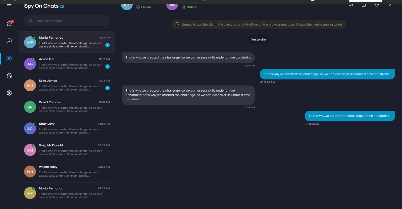
מעקב שיחות — Spy On Chats
המנהל עוקב אחרי שיחת chat פעילה בין נציג ולקוח — רואה את ההודעות בזמן אמת, יכול לדעת מה קורה, להתערב אם נדרש. Warning banner ידוע אם הלקוח offline ומוסיף context מיידי.
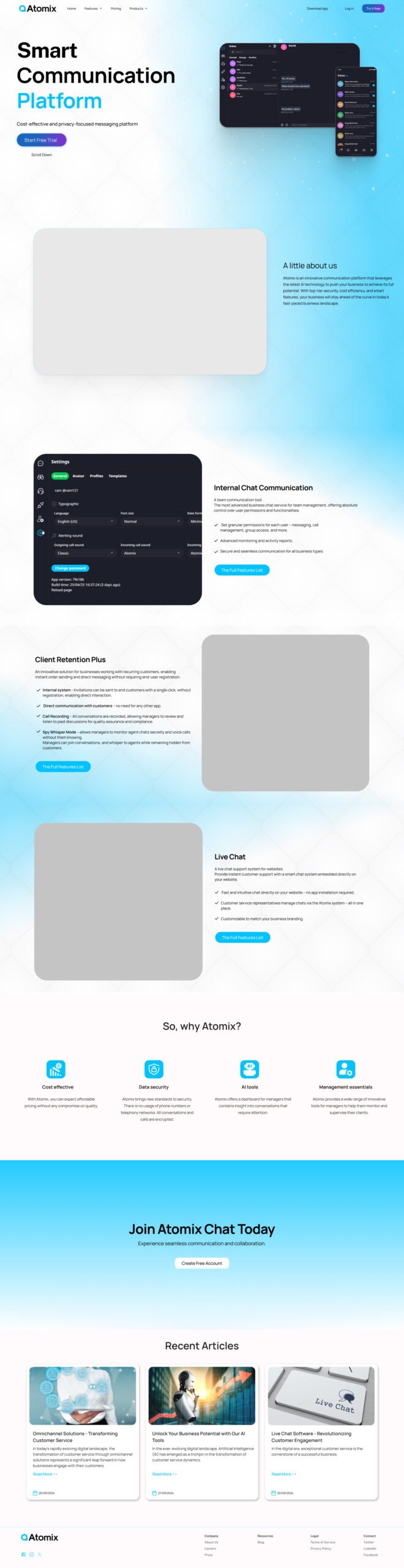
דף הבית — Smart Communication Platform
Hero עם mock ממשק Chat App + CTA כפול. מתחת: sections לכל מוצר עם video demo placeholder לכל פיצ'ר מרכזי. "So, why Atomix?" + Recent Articles + CTA סיום.

דף הבית — Mobile
גרסת mobile-first של דף הבית. כל section מקוצר ל-single column עם CTAs ברורים. טיפוגרפיה מותאמת לקריאה בנייד.
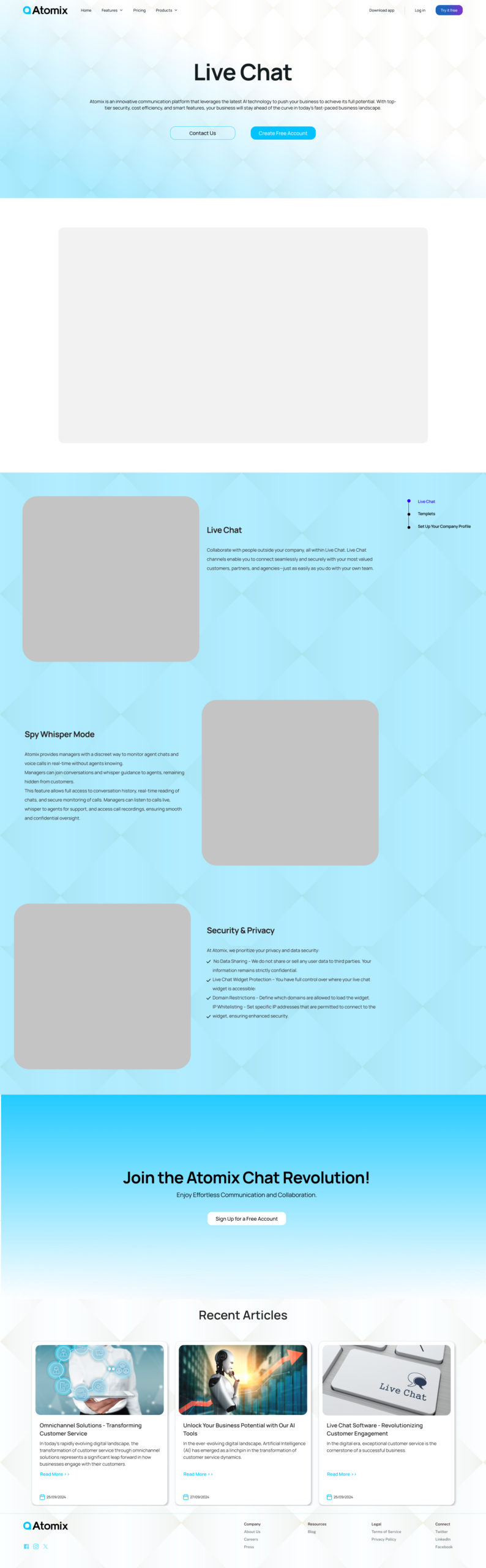
Live Chat — דף מוצר
עמוד מוצר ייעודי ל-Live Chat עם Hero, video demo placeholder, רשימת features, תרשים ויזואלי, ו-CTA ל-trial. Sticky sidebar ניווט לכל section.
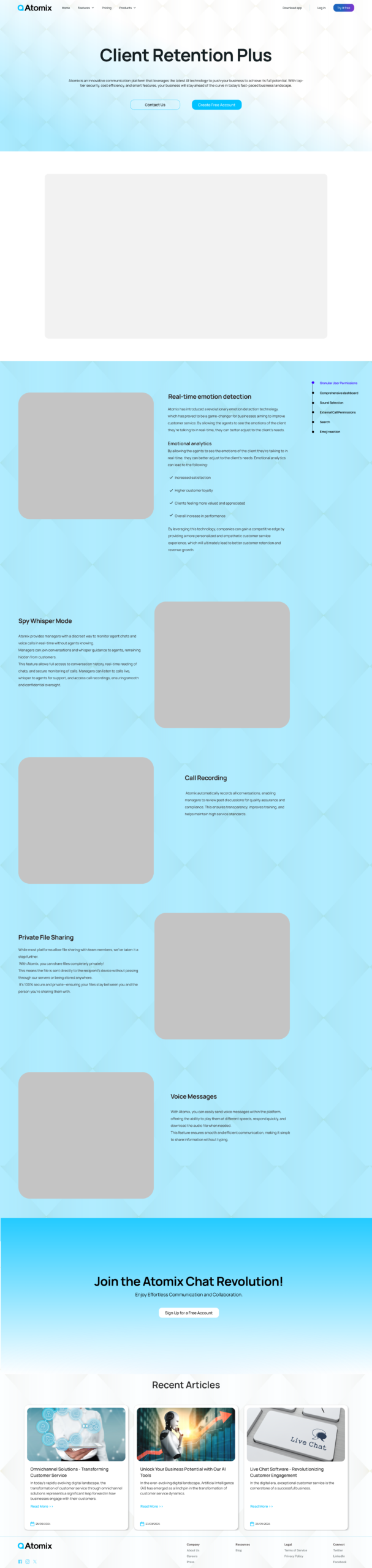
Client Retention Plus
עמוד למוצר ה-AI-powered retention עם video placeholder, feature bullets: Real-time emotion detection, Private File Sharing, Call Recording, Voice Messages.

Internal Chat Communication
כלי התקשורת הפנים-ארגוני — video placeholder, Granular permissions, Team Chat, Task tracking, Group calls. עמוד מקביל בעיצוב עם שאר המוצרים.
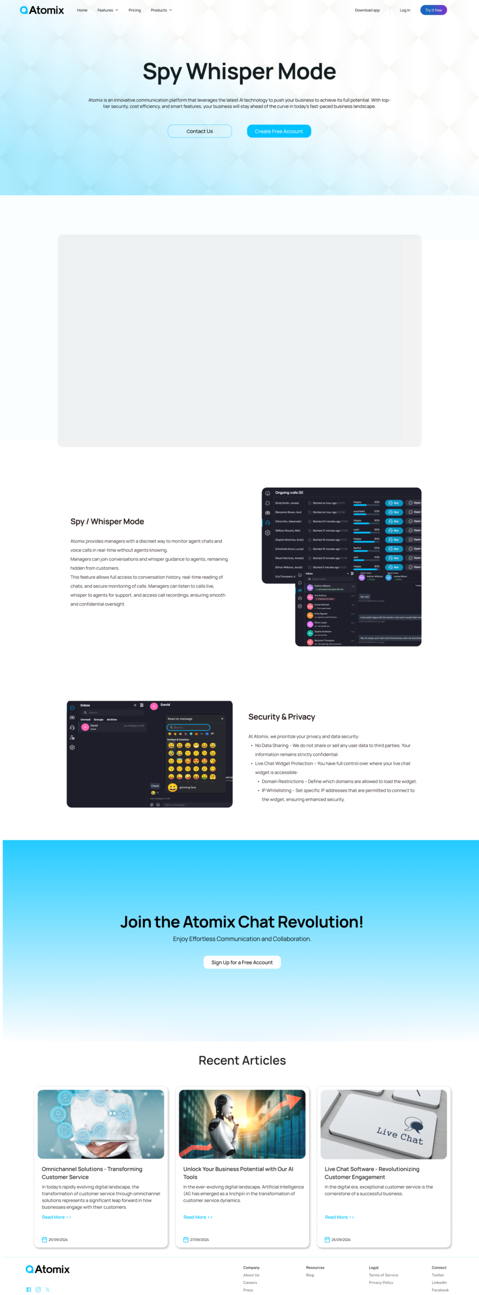
Spy / Whisper Mode
המוצר הייחודי ביותר — מנהל יכול "להאזין" לשיחה בלי שהלקוח יודע, ו"ללחוש" הנחיות לנציג. עמוד מוצר עם תרשים ויזואלי של הזרימה ו-Security & Privacy section.
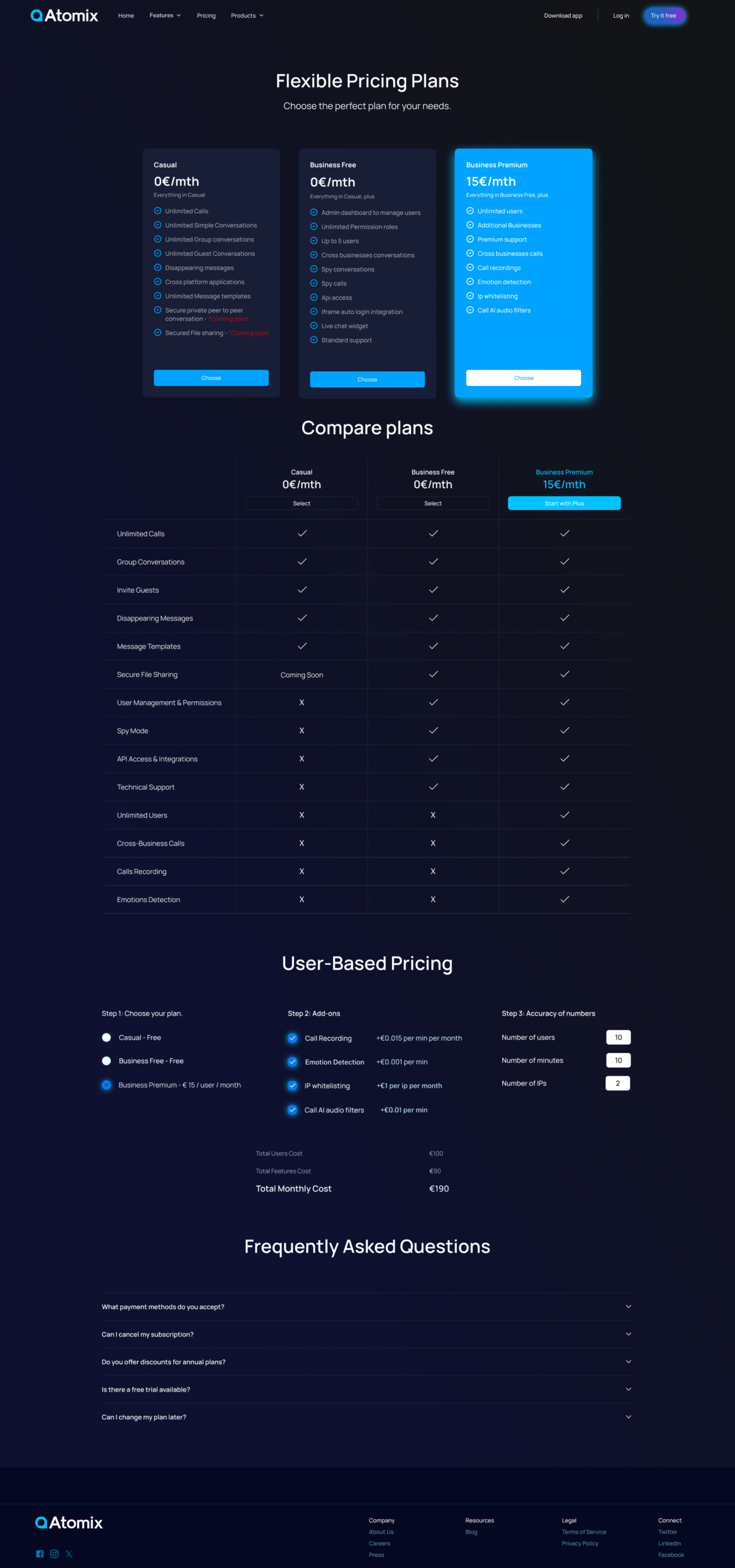
Flexible Pricing Plans
דף מחירים מלא עם 3 תוכניות: Casual (חינם), Business Free, Business Premium (15€/month). Compare plans table + User-Based Pricing Calculator ייחודי + FAQ section. עיצוב dark עם אקסנט כחול לתוכנית המומלצת.
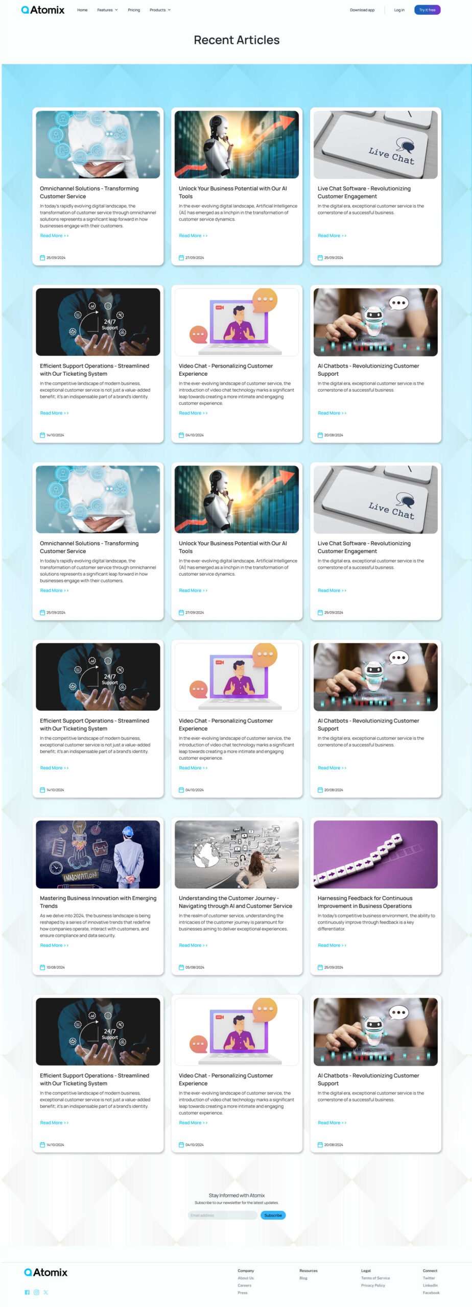
Recent Articles — עמוד מאמרים
Grid של מאמרים מקצועיים עם featured image, כותרת, תקציר ותאריך. Thought leadership positioning — Atomix לא רק מוכר כלי, אלא מוביל שיח בתעשייה.
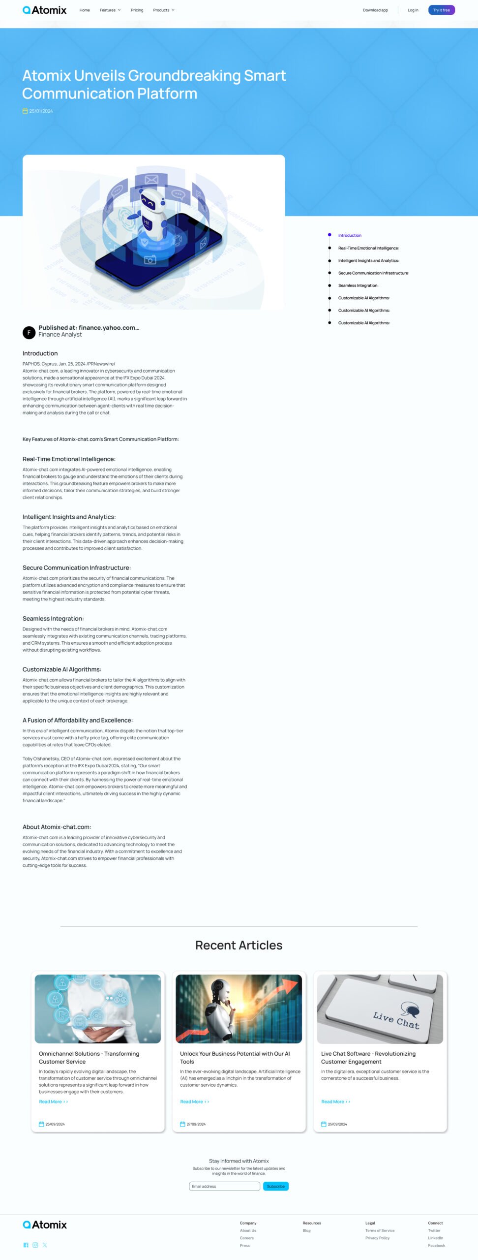
עמוד מאמר בודד
עיצוב editorial: Hero image, כותרת גדולה, breadcrumbs ניווט, body text מסודר עם headers ו-CTA נוסף. Sticky Table of Contents לניווט מהיר במאמרים ארוכים.
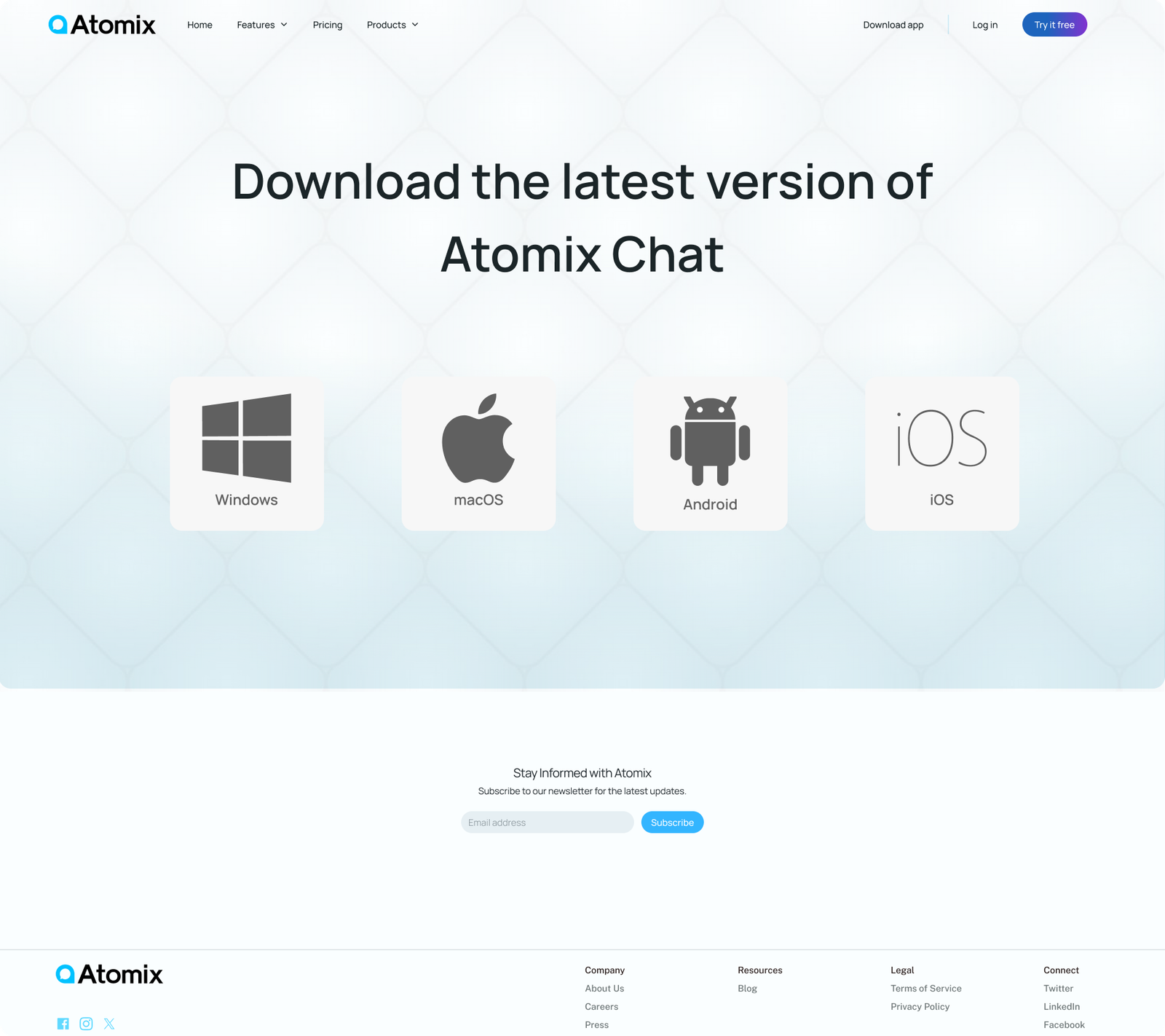
הורדת האפליקציה
עמוד הורדה עם CTA מרכזי ל-App Store, Google Play ו-Web app. Platform badges, screenshots של האפליקציה, ו-"Start Free Trial" prominent button.
איך ניגשנו לפרויקט.
העקרונות שהובילו אותי
Pricing Calculator
מחשבון מותאם אישית למשתמשי premium — פותר את הבעיה של "יותר מדי אופציות".
Sticky Menus
מאמר ארוך ודפי מוצר עם תפריט צד שמתגלגל — נגישות מתמדת.
Prototype Videos
במקום הסבר טקסטואלי על פיצ׳ר — וידאו של 8-15 שניות שמראה אותו.
Dual Language
עברית ואנגלית במקביל — חברה ישראלית עם שאיפות גלובליות.
תהליך עבודה
תהליך מקיף שכלל מחקר משתמשים, הגדרת אסטרטגיה, יצירת מערכת עיצוב מקיפה, פיתוח ויישום סופי.