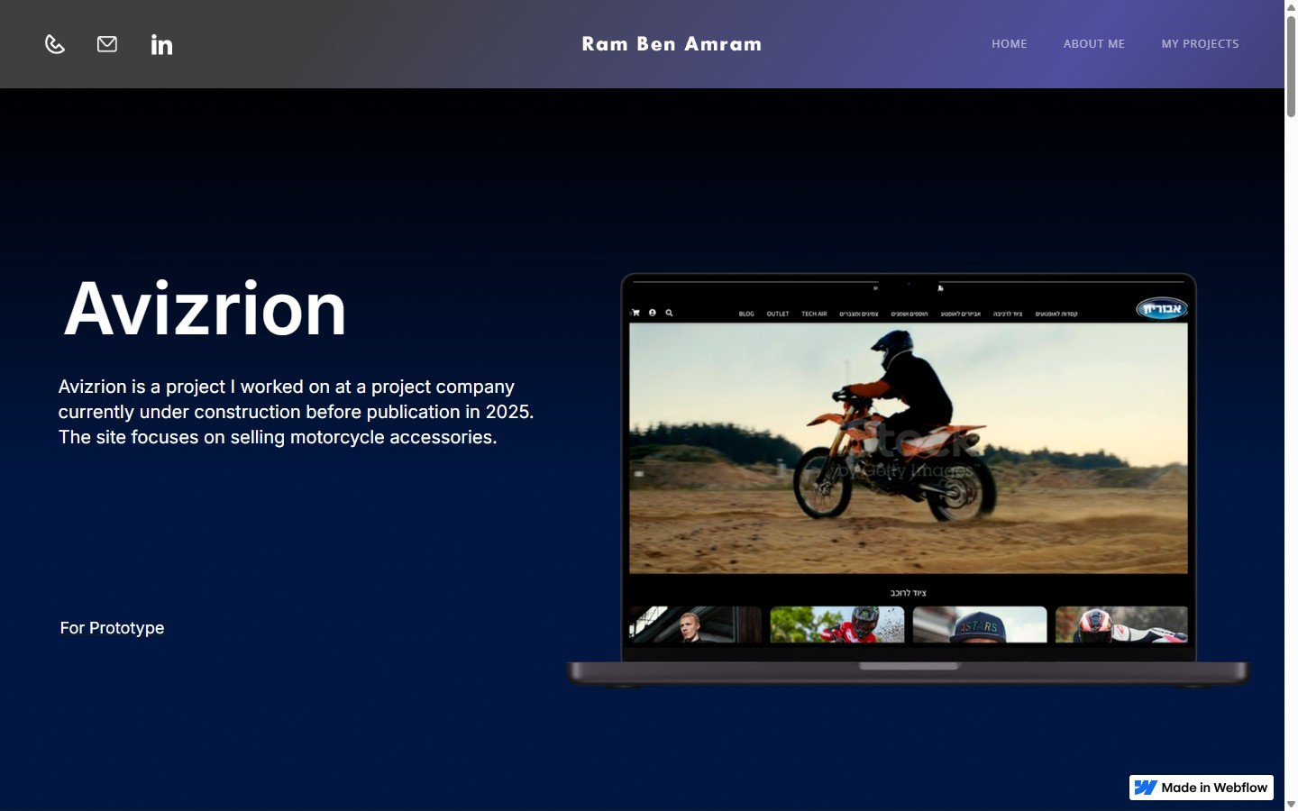
אביזריון
E-COMMERCE · MOTORCYCLE · 2025אתר למכירת אביזרי אופנועים. עיצוב מחודש שמשפר חוויית קנייה, מגדיל מכירות, ושומר על האסתטיקה השחורה של המותג.
30 שניות, אם אתה ממהר.
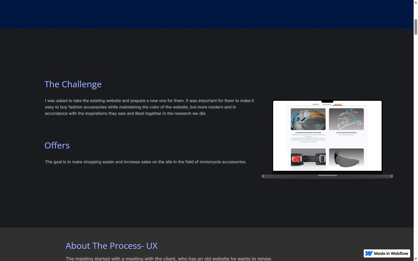
I was asked to take the existing website and prepare a new one for them. It was important for them to make it easy to buy fashion accessories while maintaining the color of the website, but more modern and in accordance with the inspirations they saw and liked together in the research we did.
שיתוף פעולה עם הלקוח — בדיקת מה עבד באתר הישן, מחקר אתרים מובילים בעולם, ושילוב התובנות. הוספת חידוש בעיצוב product description.
אתר full-fledged: Homepage, Product List, PDP עם 4 טאבים (Review, Shipping, Size, Specs), ניווט mobile מותאם.
איך מחדשים אתר e-commerce בלי לאבד את ה-DNA.
מ-Old אל New
The meeting started with a meeting with the client, who has an old website he wants to renew. First, we went through his old website and checked what worked and what didn't work in terms of sales, where he got more clicks and where he got more traffic.
Then we did market research and checked what other websites were doing and found a number of websites they liked for inspiration and ideas they wanted from there and implemented them on the new website.
יצרתי 4 קוביות לקטגוריות עם רקע שחור — לעיצוב המשך והבחנה. סקשן "Best Sellers" לבטחון רכישה, באנר מבצעים, וקובי "Why Buy From Us" לאמינות.
ב-PDP — לוגו מתחת לכותרת, גלריית תמונות מצדדית עם בחירת מידה, ביקורות מוצר עם תמונות חיות, וטבלת מידות מותאמת.
שחור עם נשמה
The color of the website was chosen to be a black shade, part of the previous website they had and they were important about it.
It was necessary to give the website a fresher and newer look. הוספתי משהו חדש ב-product description שהלקוח אהב — ביקורות מוצר עם תמונות גדולות מעוגלות לפי radius של קהל היעד.
הירו עם וידאו של אופנוע נוסע — לאלסטרציית האווירה. שחור עיקרי, accent כתום-זהב לאלמנטים פעילים.
מובייל — כל המסכים מותאמים. Hamburger menu, filter ב-bottom sheet, גלריה swipe-able.
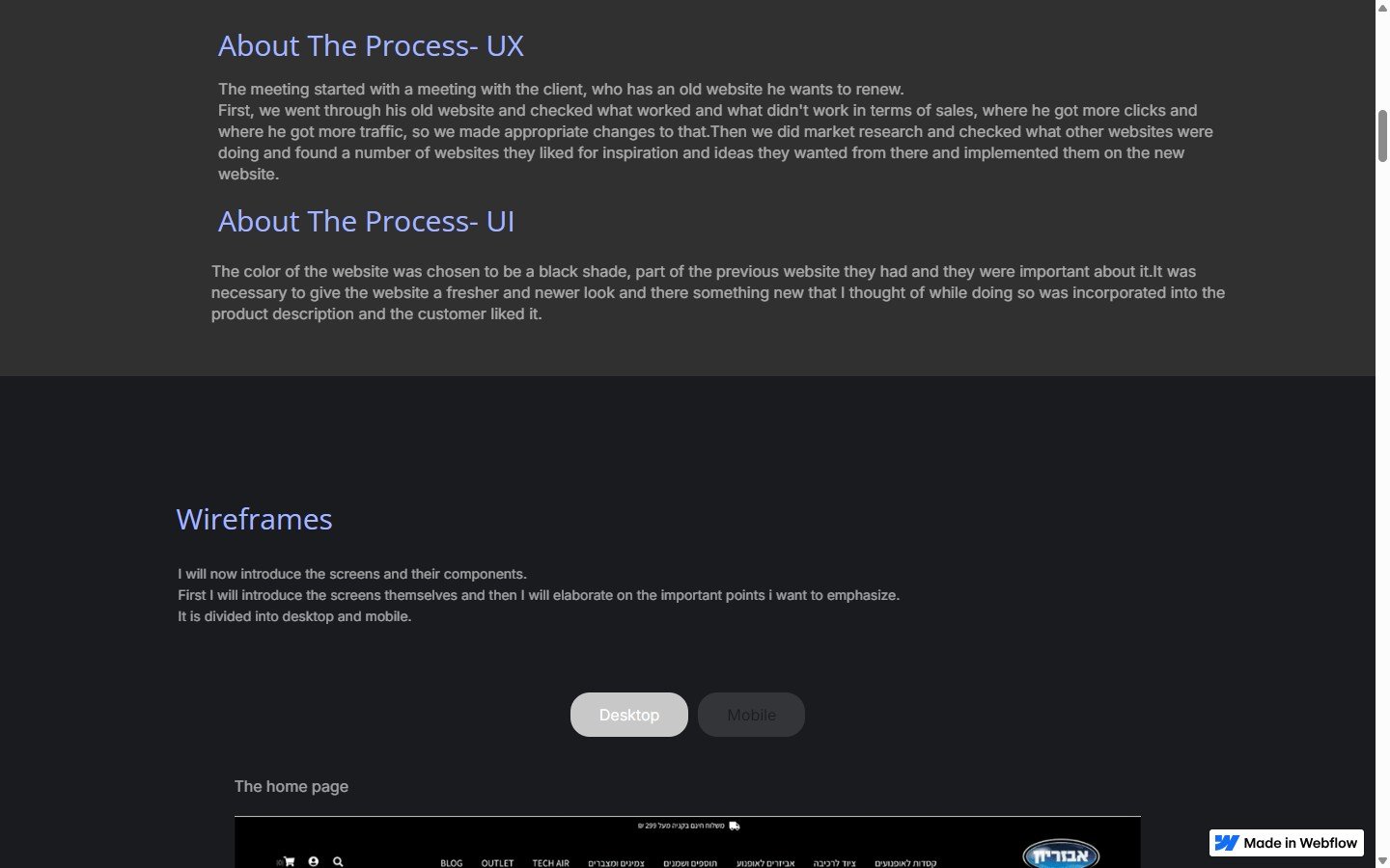
מהווירפריים לעיצוב הסופי.
מ-Wireframe גס לחנות אונליין מוכנה להשקה.
עמוד מוצר
המוצר עצמו.
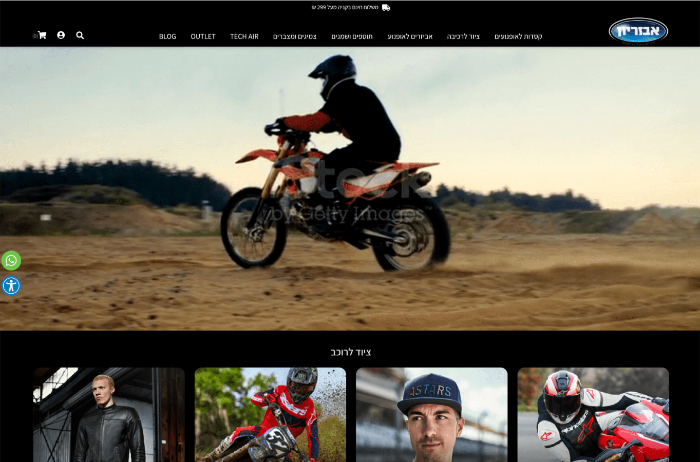
Homepage — וידאו hero + קטגוריות
ירו עם וידאו אופנוע נוסע + ניווט מלא עם קטגוריות (אביזרים, הלמטים, ביגוד, טכנולוגיה). מתחת — 4 thumbnail קטגוריות. תחושת brand אופנועים אמיתית.
PDP — 4 קטגוריות עם תיאור מלא
4-grid מוצרים בעמוד הקטגוריה. PDP עם גלריה + לוגו + בחירת מידה + ביקורות עם תמונות חיות — הרכיב שהלקוח הכי אהב.
תהליך — Wireframes עד עיצוב סופי
מסכי Desktop מלאים: Homepage, עמוד קטגוריה, PDP. ה-UX נבנה עם דגש על פשטות — פחות קליקים מהמוצר לקנייה.